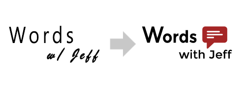
Evolution of a Logo
Does anyone remember the era when websites would redesign everything and announce that they were now on “Version 2.0” or “3.0” or whatever decimal number signified its current incarnation? I actually kind of miss those days. Even today, I think of my humble little website in terms of how many major iterations it’s been through. By my count, I’m currently on the 7th major version of this blog, and its history has been… colorful, to say the least. But the one thing I’ve never had across all these iterations is a good- or even decent-looking logo. I know my way around Photoshop well enough, but dammit Jim: I’m a writer, not a graphic designer.
With a little help from my more design-minded girlfriend, however, I think I’ve finally made something I can be proud of.
Evolution of a Logo
Introducing Words With Jeff logo version 2.0. Better than it was before. Better… Stronger… Faster… Okay, maybe not those last two, but you get the idea.
The design may look simple – perhaps even plain – but it’s actually the result of many hours of conceptualizing in my head, sketching on paper, and finally building in Adobe Illustrator. I tried to keep everything flat and minimal, as is the current trend, but I also wanted something more than the purely text-based logo I’d been using. I played around with a bunch of different ideas, including an homage of sorts to this blog’s namesake: the Scrabble clone, Words With Friends. In the end though, I kept coming back to the speech bubble. It just seemed to fit: representing both something I do a lot of (talking) and something nerdy a really enjoy (comic books). Even after I settled on the basic concept, I still spent a great deal of time fiddling with different fonts, colors, icons, and layouts. Effortless though it may seem, that logo was anything but.
I can already hear you saying “But it’s just a logo? Why would spend that much time worrying about something so trivial?” I know that it’s “just a logo,” but these little details actually do matter. Think about it this way: that small piece of graphic art is probably the first thing people see when they come to my little corner of the Interwebs. And my readers could be anyone, even a potential employer performing the inevitable Google-powered background check. What kind of message did my old logo convey to visitors? And how does that message change with the new logo? As a writer, I try to express myself to others through my writing, but I realize it’s very easy to fall into the old cliché of judging a book by its cover.
These are the kind of things that keep me up at night. Hopefully with my awesome new logo I can sleep a little sounder.


Leave A Comment